Food brands need a design that matches their taste, because customers judge your food by how your website looks. If the visuals feel off, they assume the food will be too.
We’ve spent years building websites for cafes, restaurants, and food brands across Australia, and we’ve seen the same pattern time and time again. When a brand’s design reflects the dining experience, people stay longer. When it doesn’t, they leave. It really is that simple.
In this guide, we’ll break down how food branding builds trust, why visual consistency is important, and what actually makes customers stick around.
How Does Food Brand Web Design Affect Customer Trust?
Your website is the first taste customers get of your food business, and design quality directly shapes whether they trust you. When a site looks polished, visitors assume you care about details. But when it looks dated, they start to wonder if your food is just as stale.
Here’s what builds that trust:
- First Impressions Happen Fast: Visitors form an opinion about your website in around 50 milliseconds, which is quicker than a blink. So if your design looks outdated, potential customers will question the quality of your food before reading a single word.
- Consistency Builds Credibility: Frankly, cohesive colours, fonts, and imagery signal professionalism. This is one of the core principles of web credibility, which is why it reassures users before they even glance at your menu.
- Clean Layouts Keep Visitors Around: A cluttered site confuses people and increases bounce rates. A clean design, on the other hand, makes it easy for customers to find what they need and stick around longer.
When your website design reflects the quality of your food, you give people a reason to trust you before they even walk through the door.
Why Should Your Brand Identity Reflect Your Food Products?

As we’ve already mentioned, when your visuals match what you actually serve, customers feel confident they’re in the right place. But when there’s a mismatch, confusion sets in fast (and yes, visitors notice quicker than you’d think).
Imagine a website with a sleek, minimalist design and elegant fonts. You’d expect fine dining, right? Now, picture walking in and finding a casual fish and chips shop. That gap between expectation and reality breaks trust instantly.
Your visual identity needs to echo your food products. If you run a farm-to-table cafe, earthy tones and rustic textures make sense. But if you’re selling fresh smoothies, bold colours like orange and green create the right energy.
Bottom Line: The photography style, colour palette, and typography all need to tell the same story as your menu.
Now, let’s look at how your brand’s personality plays into this.
What Role Does Brand Personality Play in Attracting Customers?
Ever walked into a restaurant that felt nothing like its website or its online presence? That disconnect pushes people away every day. Let me explain.
Casual Dining vs Fine Dining Sets the Tone
A playful, relaxed tone suits a burger joint, while refined elegance works better for fine dining restaurants. Think about Burger King. They use bold colours and cheeky copy to match their casual dining energy, and it works because the experience feels consistent.
Similarly, your website personality should mirror what customers get when they walk through the door (that’s a disconnect few food businesses can afford).
Small Design Choices Send Big Signals
Once that’s established, even the smaller details start to add up. Rounded fonts feel friendly and inviting, while sharp lines and serif fonts communicate formality. The colours, imagery, and even button shapes all influence how your target customers perceive your brand.
So every design choice either attracts your market or pushes them toward the competition.
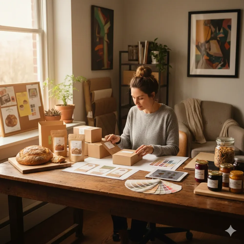
How Can Packaging Design and Interior Design Work Together for Food Businesses?
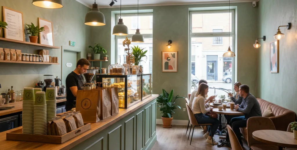
Simply put, packaging and interior design are physical extensions of your brand, and they need to speak the same visual language as your website. Believe it or not, customers notice when your takeaway box doesn’t match your dining room. That separation chips away at trust every time.
Let’s look at how alignment looks across different touchpoints:
| Touchpoint | Aligned Example | Misaligned Example |
| Takeaway box | Matches in-store colours and logo | Generic white box with no branding |
| Interior | Warm timber echoes website’s earthy palette | Bright fluorescent lighting clashes with cosy web design |
| Table setting | Reflects the same style as your online menu photos | Mismatched table details create confusion |
We’ve worked with enough food businesses to see the pattern: the ones that align their packaging with their website get remembered.
We’ve seen a coffee shop in Fortitude Valley and a bar in South Bank, both built loyal followings by keeping their venue, site, and packaging consistent. That recognition turns first-time visitors into regulars.
From there, the focus shifts to visual consistency across online platforms.
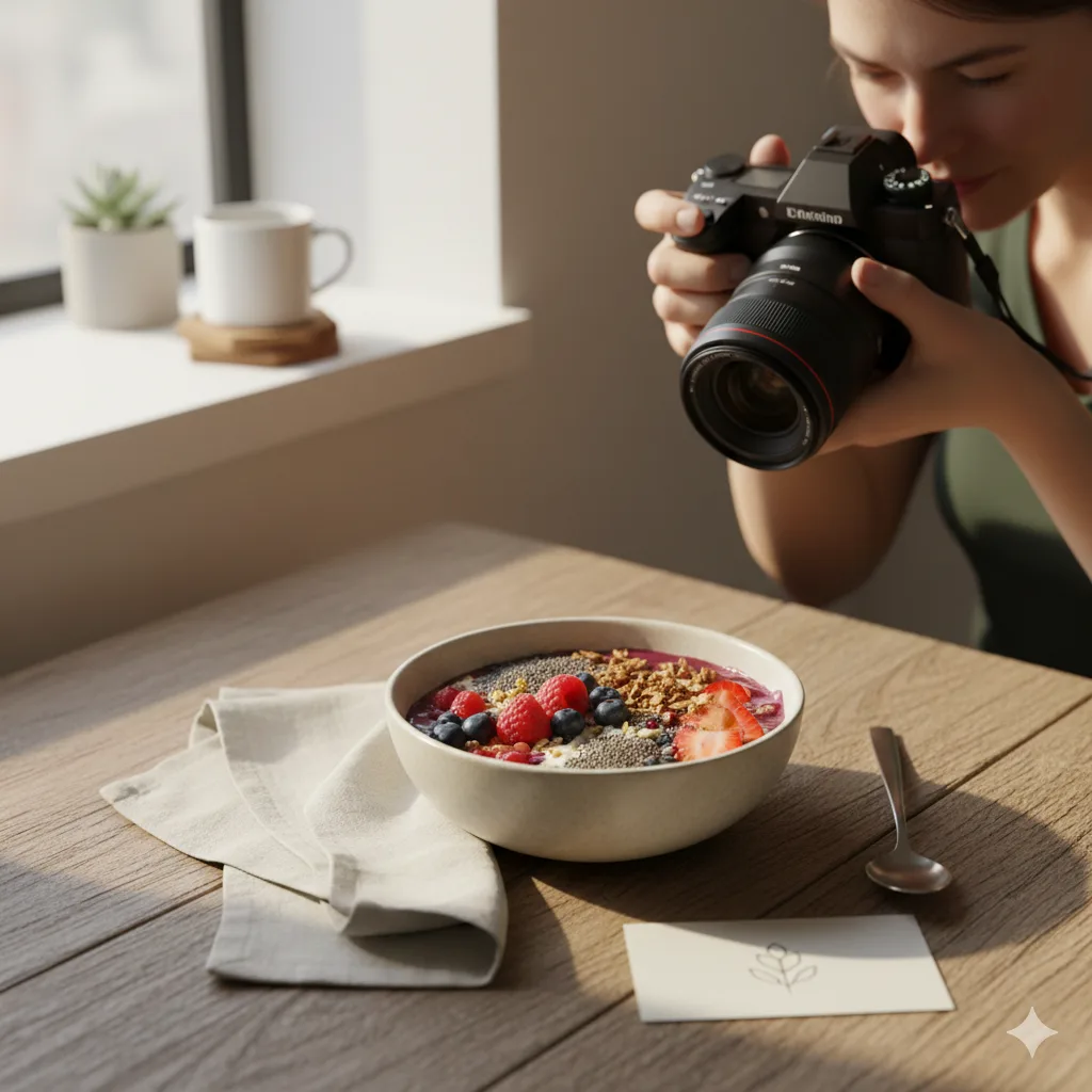
Why Do Food Bloggers and Organic Food Brands Prioritise Visual Consistency?
Food bloggers and organic food brands prioritise visual consistency because it builds recognition and trust with their audience. Posts with consistent visual branding get 33% more engagement, so it’s no surprise that these creators obsess over design cohesion.
There are a couple of things they get right:
- Personal Branding: Food bloggers rely on cohesive visuals to build a recognisable presence that followers trust and return to. Every post, story, and reel reinforces the same look, which makes their brand stick in people’s minds.
- Health-focused Imagery: Organic food brands use earthy tones and clean layouts to communicate health, sustainability, and fresh ingredients. We’ve seen Brisbane organic cafes triple their Instagram following just by tightening up their visual consistency.
- Avoid Scattered Visuals: When imagery shifts from post to post across online platforms, your audience loses track of who you are. That inconsistency makes your brand forgettable.
The same principles apply to restaurants, cafes, and food and beverage businesses of any size. Consistent visuals help you stand out in a crowded market.
How Does Online Ordering Benefit from Strong Food and Beverage Branding?
Strong food and beverage branding makes your online ordering experience feel safe and familiar. At its core, this comes down to one thing: trust. When your ordering page matches the rest of your brand, customers feel confident enough to complete their purchase.
A generic checkout page creates hesitation. But a branded one, with appetising food photos and consistent design, keeps users moving forward. Easy navigation through your menu also helps, since confused visitors tend to abandon their orders.
So when every step of the online ordering process reflects your restaurant website, you create a seamless experience that drives sales and brings customers back.
Food Branding Tips for Casual Dining and Beyond
Good food branding starts with a design that reflects what you serve. So from your website to your packaging to your venue, every touchpoint should tell the same story.
Take a look at your site and ask yourself: Does this feel like my food? If the answer is no, it might be time to make some changes. Our team at SpoonFed Atlanta has helped food and beverage businesses across Australia create consistent, inviting brands that attract the right customers, and we’d love to help you do the same.
Remember, successful branding isn’t about being flashy. It’s about being recognisable.