Your restaurant website should bring in customers, not send them running to competitors. But too many restaurant websites do exactly that.
Food website mistakes cost you orders every single day. We’re talking about simple issues like hidden menus, broken mobile layouts, and missing contact details. These aren’t small problems. They’re the difference between someone placing an order online and closing the tab in frustration.
The good news? Most of these mistakes are easy to fix once you know what to look for. Let’s walk through the biggest issues hurting food business sites right now.
Missing Mobile-Friendly Design: Why Your Restaurant Website Fails on Phones
Your restaurant website fails on mobile because it was built for desktop screens, not phones. The impact shows up in your order numbers. An MGH survey found 36% of diners abandon their orders when restaurant sites don’t work properly on mobile devices. In most cases, it’s not one major flaw. It’s a few small usability issues stacking up and pushing people away.
Text Shrinks, and Buttons Stop Working
Small fonts force diners to zoom in just to read your appetiser section. Even worse, tap targets placed too close together cause accidental clicks that send frustrated customers to the wrong pages.
Then there’s the checkout nightmare. Form fields that don’t resize properly make it nearly impossible to enter delivery addresses or payment info. When buttons disappear off-screen or overlap with other elements, customers give up and order somewhere else.
Load Times Push Customers Away
Heavy image files can slow everything down on mobile data. Your homepage might load fine on WiFi, but cellular connections often struggle with photos that weren’t compressed for mobile viewing.
Multiple redirects make it worse. Each one adds seconds before your menu appears or order buttons become clickable. Customers don’t wait around when they’re hungry. They bounce to a competitor’s site that loads faster.
Can Diners Actually Find Your Menu? The Navigation Problem
To put it simply, diners won’t find you if your site is hard to navigate. This often happens when essential links get buried under fancy animations or overcomplicated dropdowns. They might look impressive, but they frustrate visitors who just want to see what you serve.
That frustration costs you orders. The same MGH survey found that 33% of diners abandon restaurant websites with difficult navigation and choose clearer competitors instead.
Inconsistent labels across pages and missing sticky navigation only make things worse. Diners expect standard menu, hours, and ordering links, not creative naming that forces them to guess where information lives.
Missing sticky navigation only adds to the problem. When customers have to scroll back to the top every time they want basic details, they lose patience fast. Your menu link should stay visible as people browse. If diners have to hunt for simple information, they leave before placing an order.
Clunky Food Menu Design That Frustrates Hungry Customers
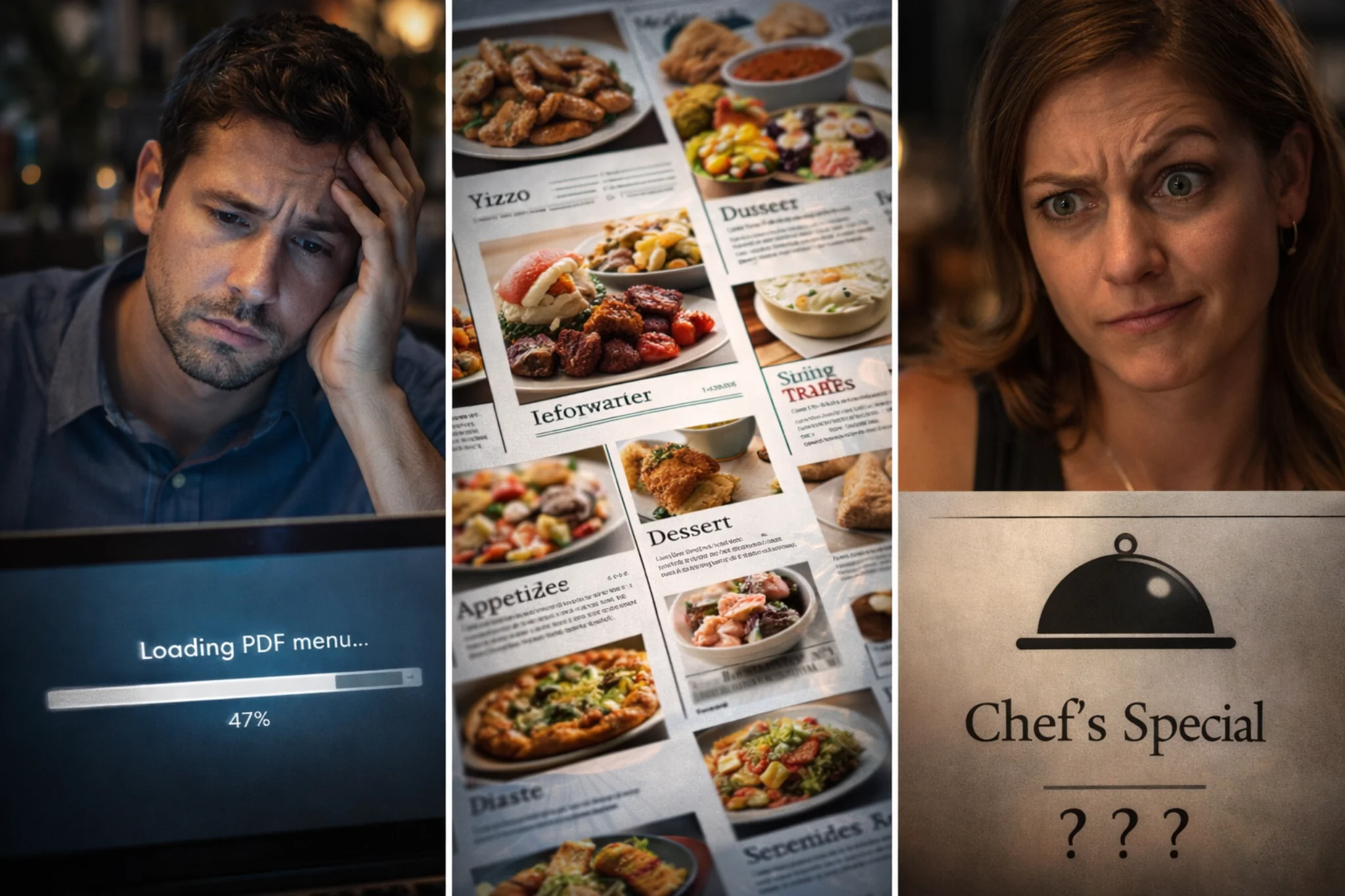
Have you ever clicked on a restaurant menu only to download a massive PDF that takes forever to load? That’s one of the most common restaurant website mistakes. It’s a symptom of clunky menu design, which usually shows up in a few predictable ways.
- PDF Menus Add Unnecessary Friction: Forcing downloads means customers have to open another app, wait for it to load, then pinch and zoom just to read your appetisers. Most people abandon the process halfway through (we’ve watched it happen countless times with client analytics).
- Poorly Organised Categories Bury Popular Items: When appetisers sit next to mains without clear sections, diners can’t quickly scan for what they want. Looking for vegetarian options? Good luck finding them when everything’s jumbled together.
- Hidden Prices Make Customers Suspicious: If they can’t see costs upfront, they won’t order. Simple as that. Vague descriptions like “Chef’s Special Pasta” tell hungry customers nothing about what they’re getting or what they’ll pay.
Getting food web design right means making menus scannable and intuitive, not obstacles that frustrate hungry customers.
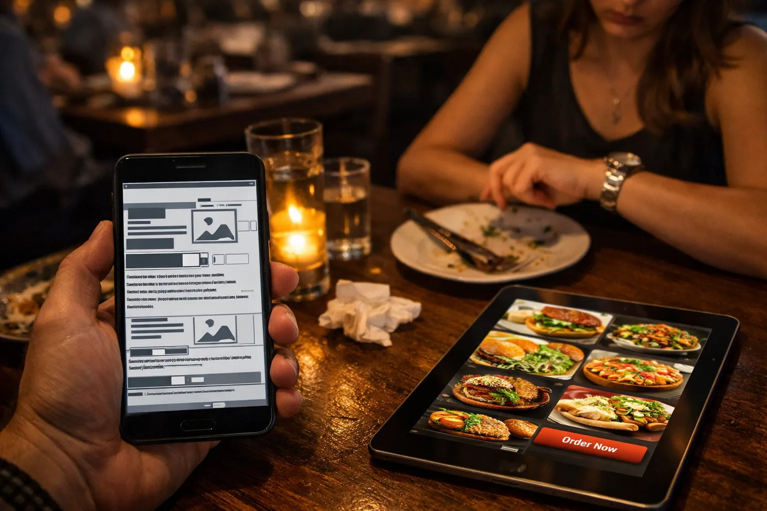
No Online Orders System: Forcing Customers to Call or Leave
The biggest advantage of having your own online ordering system is that you keep 100% of the profit and control the entire customer experience. Without one, you either lose money to third-party platforms or force customers to call, which many simply won’t do. Let’s break down the consequences.
The Cost of Relying on Third-Party Platforms
Third-party delivery apps seem convenient until you see how much they actually cost. For example, DoorDash and Uber Eats charge 15–30% commission per order, which can mean thousands of dollars leaving the business each month for busy kitchens.
The financial hit is just the start. These platforms control your customer data, so you can’t build direct relationships or run loyalty programs. When platform issues or slow payouts create cash flow problems, small restaurant operations feel it the hardest.
Phone Orders and Social Media Create Kitchen Chaos
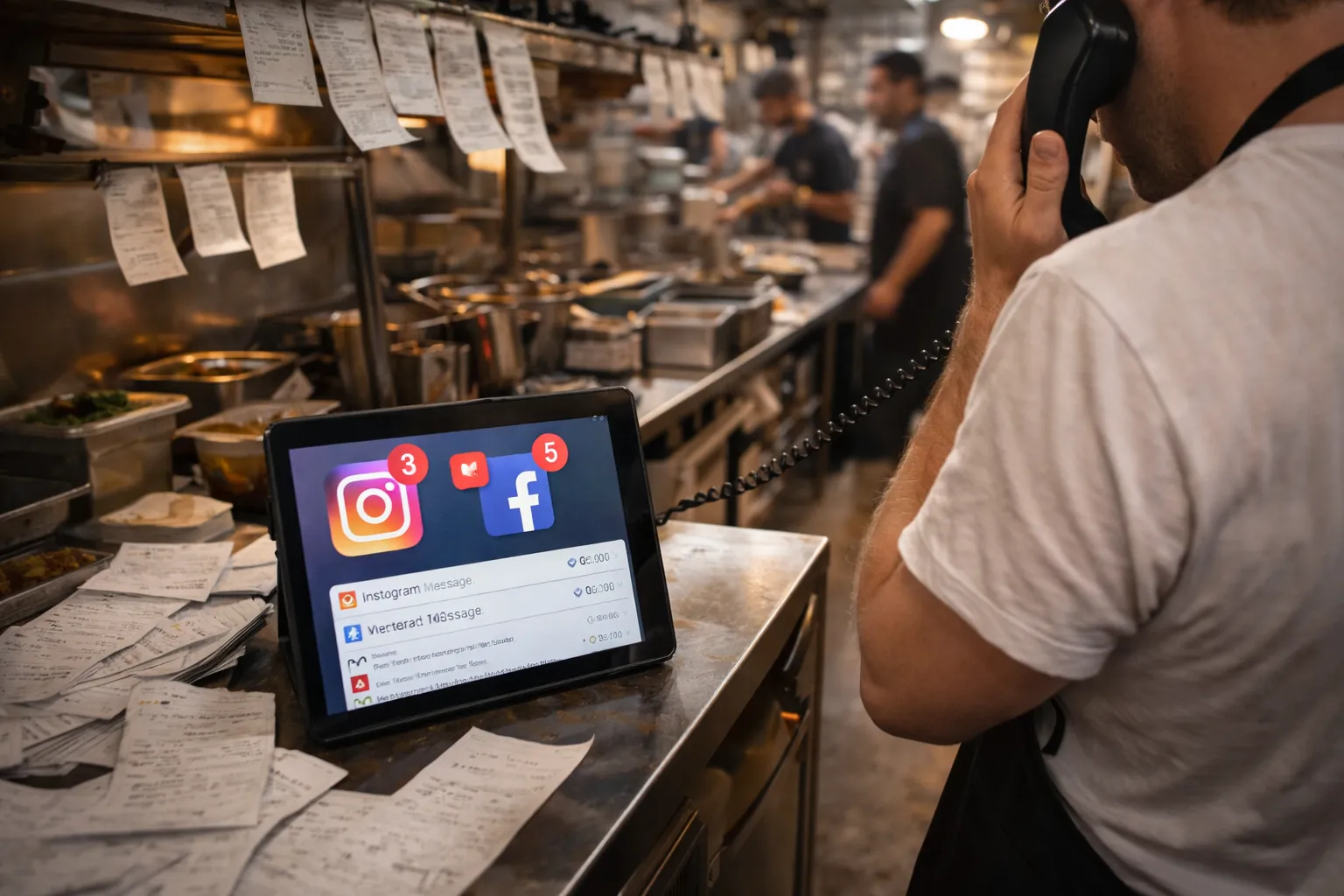
If you don’t have an online ordering system, you’re forced to manage orders through phone calls and social media. On the surface, this can seem like a sensible, low-cost option.
In reality, it creates operational strain fast. Handling orders manually means you need more staff time just to keep up, which increases costs rather than reducing them.
That’s not all. Phone-based ordering often leads to miscommunication, which results in wrong orders, refunds, and customers who don’t return. Similarly, orders arriving through Instagram DMs, text messages, and phone calls can get lost or duplicated because there’s no single system tracking everything.
The chaos gets worse when things get busy. Staff can’t juggle ringing phones, incoming messages, and in-store customers at the same time. Important orders slip through the cracks.
Poor Food Photography That Doesn’t Make People Hungry
Would you order a dish based on a dark, blurry photo that makes it look like leftovers? Probably not. When images are dark or blurry, even your best dishes look unappetising, and potential customers keep scrolling.
Stock photos make it worse. They don’t represent what customers actually receive, which kills trust the moment the food arrives. We’ve seen restaurants use the same generic pasta photo for years while their actual menu looks completely different.
The other problem is placement. Many restaurants put all their effort into menu photos but leave the homepage bare. Your homepage is where first impressions happen, and without strong hero images showing your best dishes, you’re wasting space that should make people hungry immediately.
Professional food photography builds trust and drives orders. When visitors see well-lit photos of your actual dishes right away, they’re far more likely to browse your menu and place an order.
Missing Contact Details and Opening Hours on Every Page
Once diners find your menu and decide what they want, the next question is always the same: are you open right now? When basic contact details and opening hours are hard to find, frustrated visitors often leave without ordering.
Here are the three most common ways this happens:
- Hidden Phone Numbers and Addresses: Customers shouldn’t need to dig through multiple pages just to find where you’re located or how to call for reservations.
- Hours Buried in Footers: When opening hours are tucked away at the bottom of one page, people waste time searching. Worse, they show up when you’re closed and leave angry reviews.
- Missing Click-to-Call on Mobile: Making customers manually type your phone number on their phones adds unnecessary friction. One tap should connect them directly, not require copy-pasting or memorising ten digits.
We recommend placing your contact information and Google Business Profile link in the header or footer so they are visible on every page your visitors land on.
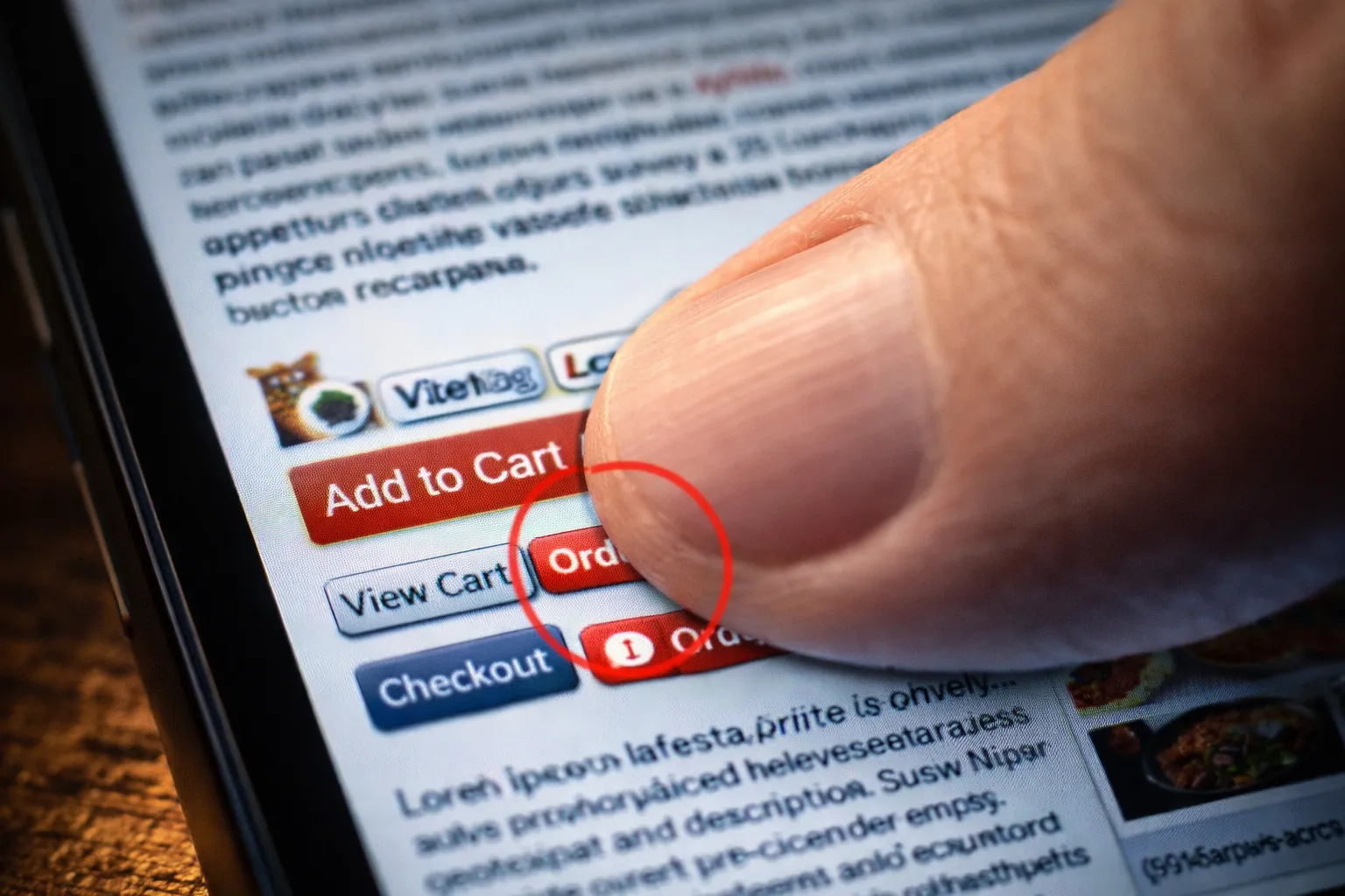
Weak CTAs and Hidden Reservation Buttons
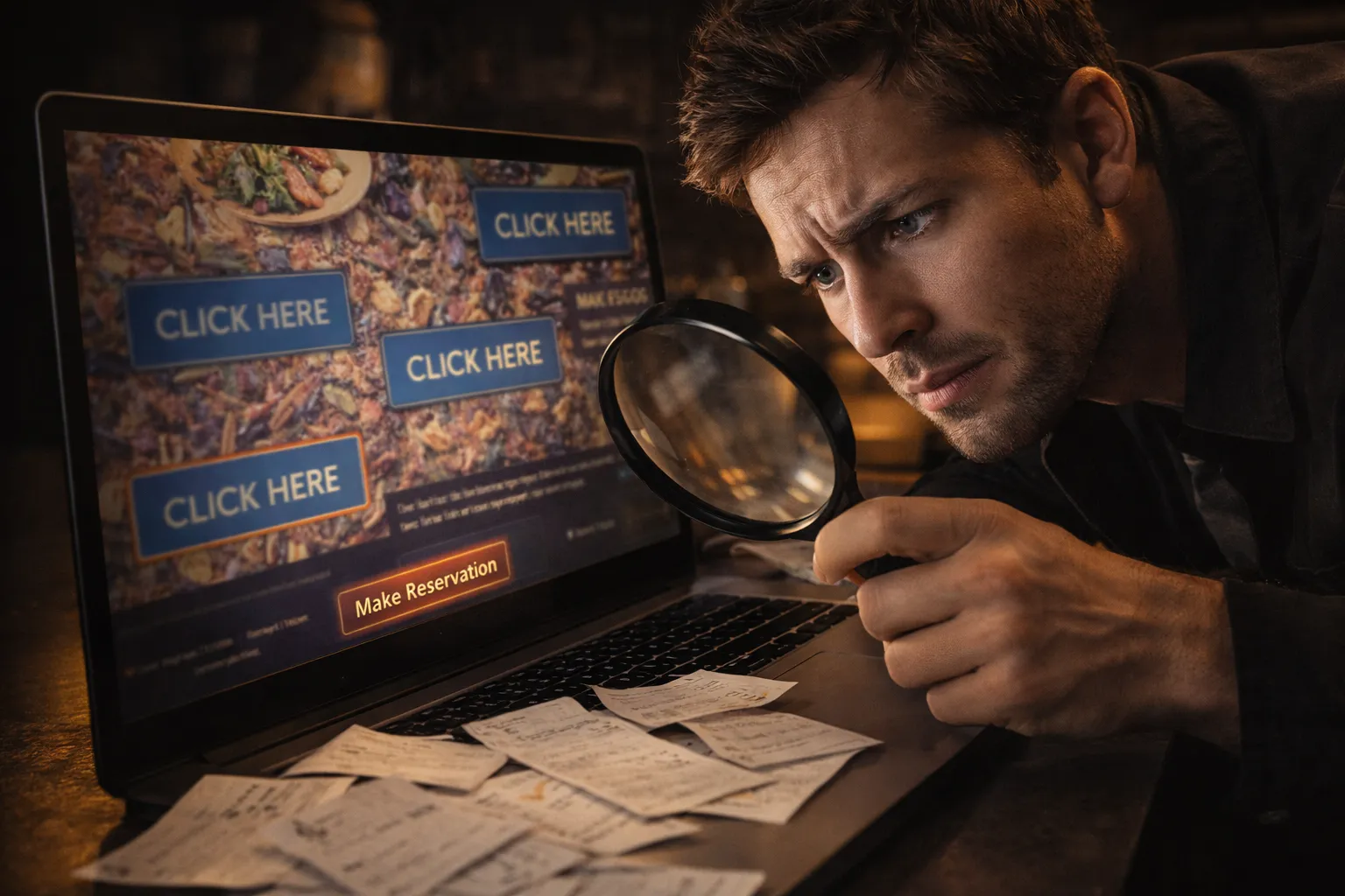
Generic “Click Here” buttons don’t tell customers what happens next, so they ignore them. Clear CTAs like “Book Your Table Now” or “Order Takeaway” remove that guesswork by telling people exactly what happens when they click.
Placement is just as important as wording. When reservation buttons blend into your background or hide in cramped sidebars, visitors scroll right past them (even when they’re actively looking to book).
The biggest mistake? Only putting one reservation button at the top of the page. By the time someone scrolls through your menu and decides they want to eat at your restaurant, that button is long gone. They shouldn’t have to scroll back up to find it.
Outdated Design That Makes Your Restaurant Look Closed
An old-fashioned website makes diners wonder if you have closed down or stopped caring about your business. Some obvious warning signs include Flash elements, auto-play music, clashing colours, and pixelated logos, all of which make even well-known restaurants look sloppy.
Layouts designed for desktop only when most people browse on phones are another red flag. When your site does not work properly on phones, customers assume your restaurant operates the same way, outdated and difficult to navigate.
By contrast, a modern website signals that your business is active, professional, and worth visiting. It builds trust before customers even step through your door and shows you’re keeping up with both technology and diner expectations.
Fix These Food Website Mistakes Before You Lose Another Order
These website mistakes cost restaurants real money every day. Mobile issues, hidden menus, missing ordering systems, and outdated designs all push customers toward competitors with better online experiences.
You don’t need to fix everything at once. Start with the issues hurting you most. If mobile traffic makes up most of your visitors, prioritise a mobile-friendly design. If you’re losing orders to third-party apps, build your own ordering system.
Need help fixing your restaurant website? SpoonFed specialises in building food business websites that actually convert visitors into customers. Let’s make your site work as hard as your kitchen does.