Surveys show that 80% of diners check a restaurant’s website before visiting or ordering. That’s why restaurant website design trends for 2026 focus on getting more people to order, book, or call for their services. And your website design decides if someone becomes a customer or moves to a competitor.
However, flashy animations and random features harm your website more than converting to orders. Plus, food businesses that ignore mobile-friendly design lose sales to competitors who understand the value of investing in a good website.
In this article, we’ll cover the specific website trends helping restaurants increase online orders and bookings. You’ll also learn which design choices bring the best results and which ones just look pretty without adding value.
Let’s begin with understanding why your restaurant website design is important.
Restaurant Web Design Trends to Follow in 2026
Web design trends now connect directly to business outcomes like increased takeaway orders and reservations. And even a small change to your site can mean the difference between someone placing an order or giving up halfway through.
Take a look at why these trends are important for your business.
Design Choices That Drive Online Orders
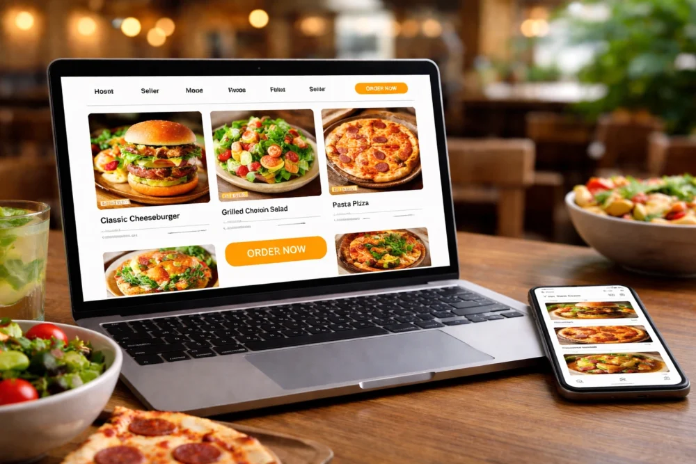
A simplified ordering process with just a few clicks keeps hungry customers from bouncing to competitors with easier sites. Particularly, clear menu photos and one-click ordering buttons increase conversion rates by reducing decision fatigue.
For example, a strategic placement of “Order Now” buttons throughout the page keeps the action visible without being pushy.
So instead of hiding the ordering button in a corner or footer, successful restaurant sites place it in the top navigation, beside each menu item, and at the end of menu sections. As a result, you get fewer abandoned carts when someone’s ready to buy lunch.
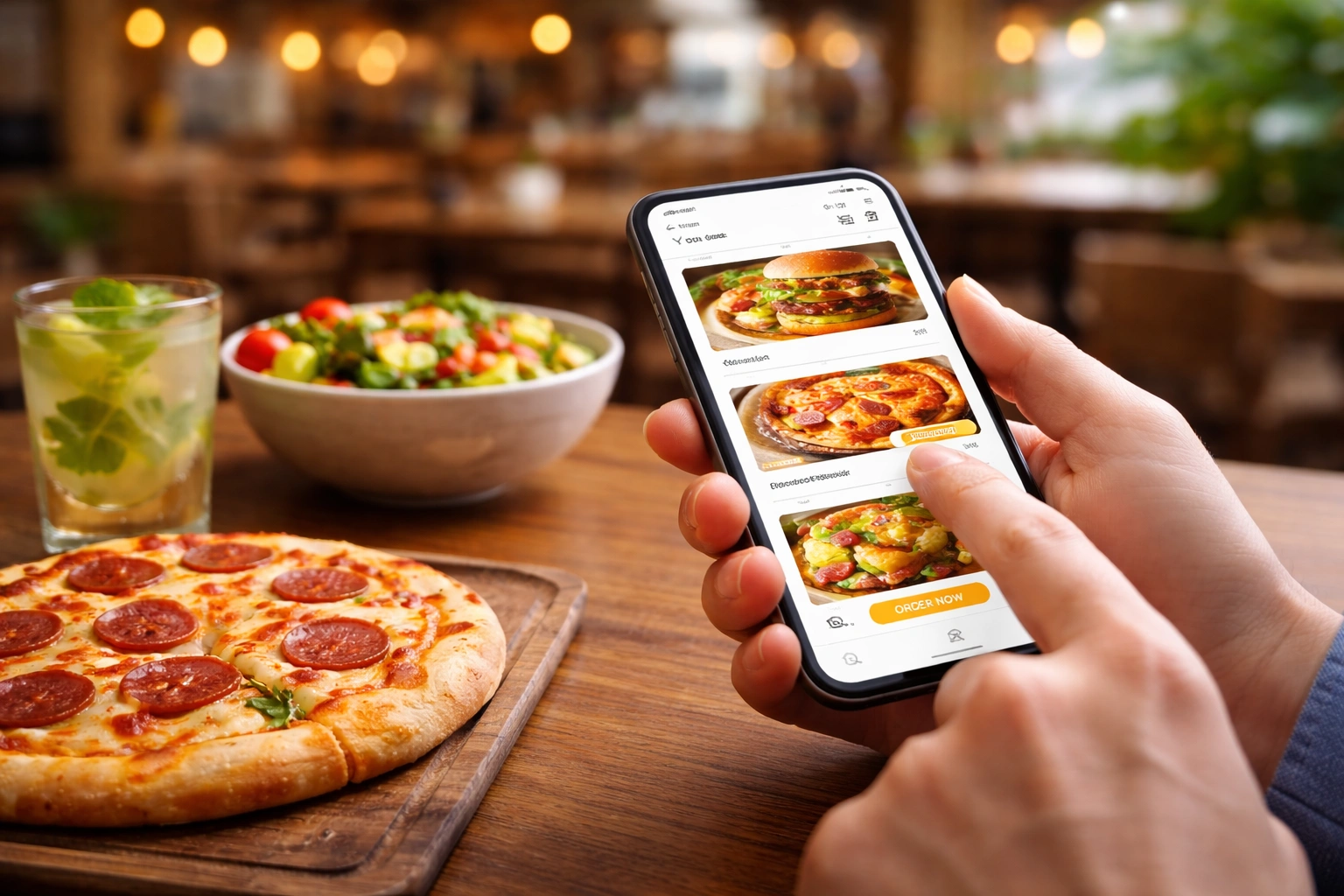
Mobile Menu Design Gets More Attention Than Desktop
We’ve seen many Brisbane cafe sites lose almost half their mobile visitors within seconds when the menu options don’t load properly on phones. That’s because around 78.4% of restaurant website visits occur on phones, especially during lunch and dinner rushes.
Usually, thumb-friendly buttons and readable text sizes make browsing menus feel natural on small screens. To give you an idea, mobile menu buttons need to be at least 44 pixels tall so users can tap them easily without zooming in or accidentally hitting the wrong option. You should also add a responsive menu that adjusts to different screen sizes automatically.
Interactive Menus: What Food Businesses Are Doing Differently
Most people abandon their order halfway through if the menu’s hard to use on mobile. For this reason, interactive menu features in 2026 focus on speed and convenience instead of fancy graphics that slow everything down.
Here’s what restaurants are doing differently with their menus:
- Swipeable Menu Sections: The app functions like Instagram stories, where you swipe left or right between categories. So people can browse appetisers, mains, and desserts without endless scrolling.
- Dietary Filter Options: Vegan, gluten-free, and dairy-free filters help customers find suitable dishes in one tap (we’ve seen most venues forget about this until someone complains). For example, someone with a nut allergy can filter out every dish containing nuts instantly.
- On-Page Customisation: Customers can add or remove ingredients, choose portion sizes, and see the price update in real time. This feature is much better than old dropdown forms, where you had to click through multiple pages just to remove onions from your burger.
- Food Photos for Each Item: Menus with clear photos of each dish convert better than text-only options. When people can see what they’re getting, order values go up.
- Live Item Availability: With this feature, the website automatically greys out sold items during peak hours and shows when dishes will be available again. A responsive menu that updates in real time prevents the frustration of ordering something that’s already gone.
These menu functions make ordering faster and easier for customers. As a result, restaurant owners see fewer abandoned carts and higher average order values.
Online Ordering UX: Remove Friction or Lose Sales
The fastest way to increase online orders is to make your checkout process simpler than your competitors’. This is because your website design choices in the ordering flow directly impact how many people complete their purchase all the way.
You’ll see below what makes the difference in online ordering.
Guest Checkout Beats Forced Account Creation
Making people create accounts before ordering adds unnecessary steps that drive them to competitors instead. When we A/B tested this feature for Queensland cafe clients, completed orders increased by more than 34% compared to forced registration.
The reason is that guest checkout with optional account creation after purchase respects the customer’s time and urgency. This allows visitors to enter their details, complete payment, and get their confirmation in under a minute.
Along with that, saved cart details for returning guests speed up their next order without forcing logins. You get the advantages of having user accounts, while still letting new customers buy quickly.
Real-Time Order Tracking Reduces Support Calls
Live status updates keep customers informed without phone calls. The mobile app automatically shows where an order sits in the queue with updates like “received,” “preparing,” “ready,” or “out for delivery.”
Furthermore, estimated pickup or delivery times set accurate expectations and reduce “where’s my order” enquiries. Good app designs often include a progress bar that updates by default as the kitchen works through orders.
Pro Tip: Add SMS or push notifications features about order progress. That way, people don’t need to refresh the page constantly.
Payment Options That Match Customer Preferences
Offering multiple payment tools instead of just credit cards increases conversions, especially during busy lunch hours. For instance, Apple Pay, Google Pay, and buy-now-pay-later services cater to different customer payment habits.
Alongside this, clear pricing with delivery fees shown upfront prevents checkout surprises that kill conversions. Because when customers see the total cost early, they’re more likely to complete the order instead of abandoning at the last step.
Did You Know? 39% potential customers abandon the checkout page because of sudden extra costs.
Large Visuals vs. Clever Graphics: Which One Wins?
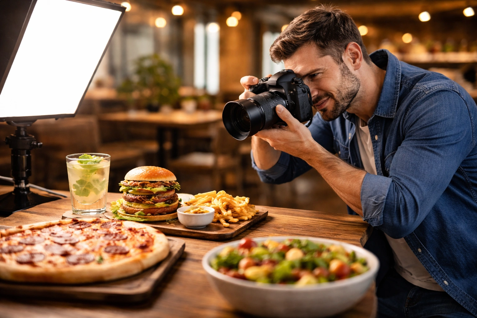
One good photo of your signature dish is much better than a dozen animated graphics when someone’s deciding where to eat. Specifically, full-screen hero images of signature dishes grab attention faster than illustrated icons or abstract graphics.
We’ve built sites for over 80 Brisbane food businesses, and web design with large food photography always converted better than sites heavy on digital elements. It’s because people want to see the actual meal they’re about to order, and real photos of your food build trust better than stock images or overly-designed mockups.
Take a look at this comparison, and you can decide for yourself:
| Large Visuals | Clever Graphics |
| Real food photos show exactly what customers get | Sticker graphics and illustrations look decorative, but don’t build trust |
| High-quality images with soft shadows or subtle gradients stay on brand | Neon gradients and animated elements distract from the actual food |
| One strong visual per page keeps focus clear | Multiple digital elements compete for attention |
| Loads faster, works better on mobile | Heavier file sizes slow down the site |
Some restaurants add visual storytelling with simple touches, which works fine as long as it stays consistent with your overall brand.
Bonus Tip: White space around large visuals keeps the focus on food without distracting elements.
Website Design That Loads in Under 3 Seconds
Fast-loading pages keep hungry customers on your site instead of bouncing to the restaurant that loads first. On the other hand, a slow website kills conversions even if your food photos look great and your menu is easy to navigate.
Here are some methods that make pages load faster:
- Compressed Images: Images that are compressed to web-optimised sizes load in seconds instead of making people wait. That way, your website maintains visual quality while cutting load times that make mobile users bounce immediately.
- Lazy Loading: Off-screen content loads only when needed, so the necessary elements appear immediately on any device. To give you an example, the mobile site will show the menu and ordering button first, then load the footer content as people scroll down.
- Minimal Scripts and Plugins: Every extra plugin adds seconds to your load time. And slow-loading features frustrate hungry customers trying to order (yes, even that cool parallax effect you’d love to put on your website).
- Fast Hosting Infrastructure: Shared hosting plans often buckle under pressure, while dedicated servers keep pages loading smoothly. As a result, a traffic spike during dinner rush doesn’t crash or lag the site.
Most importantly, Google’s search algorithm favours fast sites, so speed directly affects how many people even find your restaurant online. Which is why a simple site that loads in under three seconds retains 53% more visitors than a beautiful one that takes longer.
Ready to Update Your Restaurant’s Web Design?
The web design trends for 2026 prioritise making the checkout process smooth and building credibility. Because that is what brings more orders and bookings through your website. The right web design trends make your restaurant easier to find, to order from, and to trust.
So start by reviewing your current site and focus on fixing your most urgent problems over the next few months instead of redesigning everything at once. At the end of the day, your website should work as hard as your business does to bring in orders every single day.
If you’re looking for help with food business websites that drive results, Spoon Fed Atlanta specialises in building sites for restaurants that increase online orders. Our team has worked with clients across Brisbane and Queensland to create websites that convert browsers into customers.