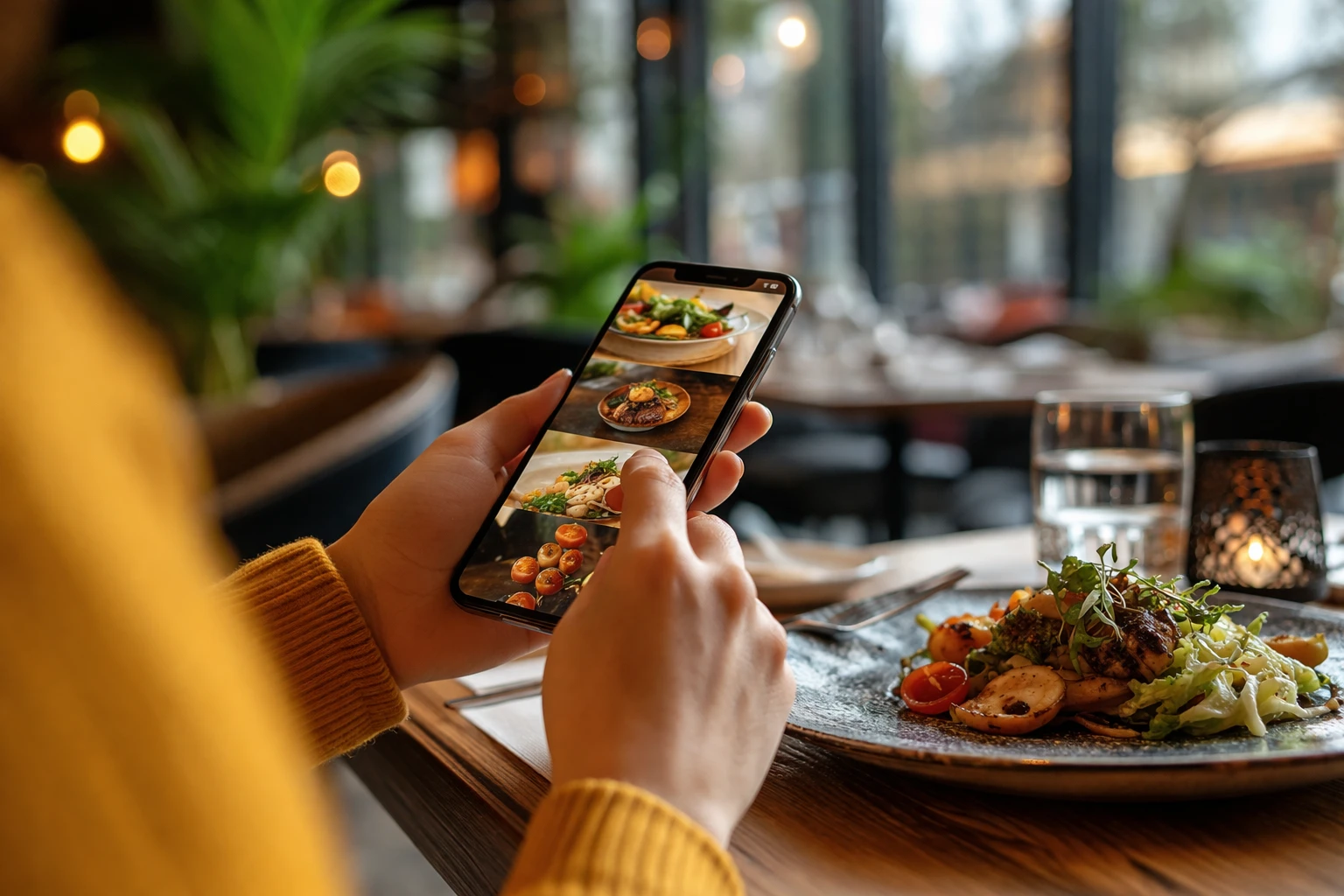
Mobile-first web design means building your restaurant website for smartphones first, then scaling it up for larger screens like tablets and desktops. It’s an essential step because 63-65% of all Google searches now occur on mobile devices.
And when your website loads slowly on mobile, has tiny buttons, or forces people to pinch and zoom just to read your menu, users bounce to competitors instead.
In this article, we’ll explain how mobile-first design is essential for your restaurant. We’ll also cover topics like thumb-friendly layouts for small screens and page speed fixes that improve load times.
Read on to see what’s holding your restaurant site back.
What Makes Mobile-First Design Different for Restaurants?
Mobile-first design for restaurants is built around on-the-go users who want to easily find and order the food they want.
Most web designers used to start with desktop computers, then shrink everything down to fit mobile. However, when you squeeze a desktop site onto a small screen size, buttons become impossible to tap, and food photos look squashed.
Here are the merits of designing for mobile first instead.
Mobile First vs. Desktop First: The Main Difference
Desktop-first sites cram way too much content onto small screens. That way, text becomes unreadable, buttons overlap, and your beautiful menu layout becomes a mess. It forces people to zoom in and out just to figure out what you’re serving.
Mobile-first design flips this around. In this approach, you start with what’s more important on mobile: clean navigation, readable text, and tap-friendly buttons. So the mobile version stays neat and functional, while the desktop gets the extras later.
Why Food Businesses Can’t Ignore Mobile Devices
The main reason to go mobile-first is that most of your customers are searching on their phones right now (especially during lunch rushes when people are starving). And 76% of these searches lead to a visit within 24 hours.
Plus, Google’s search engines now rank mobile-friendly sites higher when people look for restaurants. If your site doesn’t work well on mobile devices, you’re basically invisible to hungry mobile users scrolling through their options.
Core Mobile UX Tips: The Thumb Zone Rule
People usually hold mobile devices with one hand and use their thumb to navigate. This “thumb zone” is the area your thumb can comfortably reach without stretching or shifting your grip. It’s more or less the bottom-middle section of the screen.
Take a look at these mobile UX tips worth paying attention to.
Tap Targets That Work on Smaller Screens
Making your buttons larger prevents frustrated customers from giving up (and adds aesthetics if done right).
A general rule of thumb: buttons need to be at least 44×44 pixels so people don’t accidentally tap the wrong thing. When you’re designing for different mobile devices and tablet devices, ample spacing between clickable elements prevents mistakes. It’s best to space things out by at least 8-10 pixels.
Along with that, large, user-friendly “Order Now” or “Book Table” buttons get way more clicks than tiny text links buried in paragraphs.
Thumb-Friendly Menu Navigation (No Pinching Required)
A thumb-friendly menu allows your customers to browse your food offerings using one hand without zooming or pinching. We’ve built menu systems for Brisbane cafés where customers book tables instead of bouncing to competitors’ sites, and these are the practices we follow:
- Horizontal scrolling menus work really well for food categories
- Sticky navigation bars keep important links visible as users scroll through your restaurant website
- Hamburger menus (those three-line icons) collapse mobile content to save space without hiding everything
- Collapsible sections let diners expand only the menu categories they want to see
If someone’s looking for lunch specials, they don’t need your entire dinner menu cluttering up their screen. These design additions make it easier for customers to order online without fighting with the web interface on their phone.
Avoiding Disruptive Pop-Ups That Kill Conversions
Google penalises sites that show full-screen disruptive pop-ups the second someone lands on your mobile pages. This is why exit-intent pop-ups work better because they only appear when people are about to leave your site anyway.
Quick Tip: Small banner notifications at the top or bottom don’t block mobile content and feel way less annoying. Google doesn’t penalise these.
Page Speed Optimisation for Mobile Devices
Fast load times are the difference between a customer viewing your menu and them clicking back to your competitor. For your reference, 53% mobile users expect pages to load in under three seconds. That means, slow-loading restaurant sites lose customers before they even see your menu or contact details.
This is how you can optimise your page speed for mobile devices.
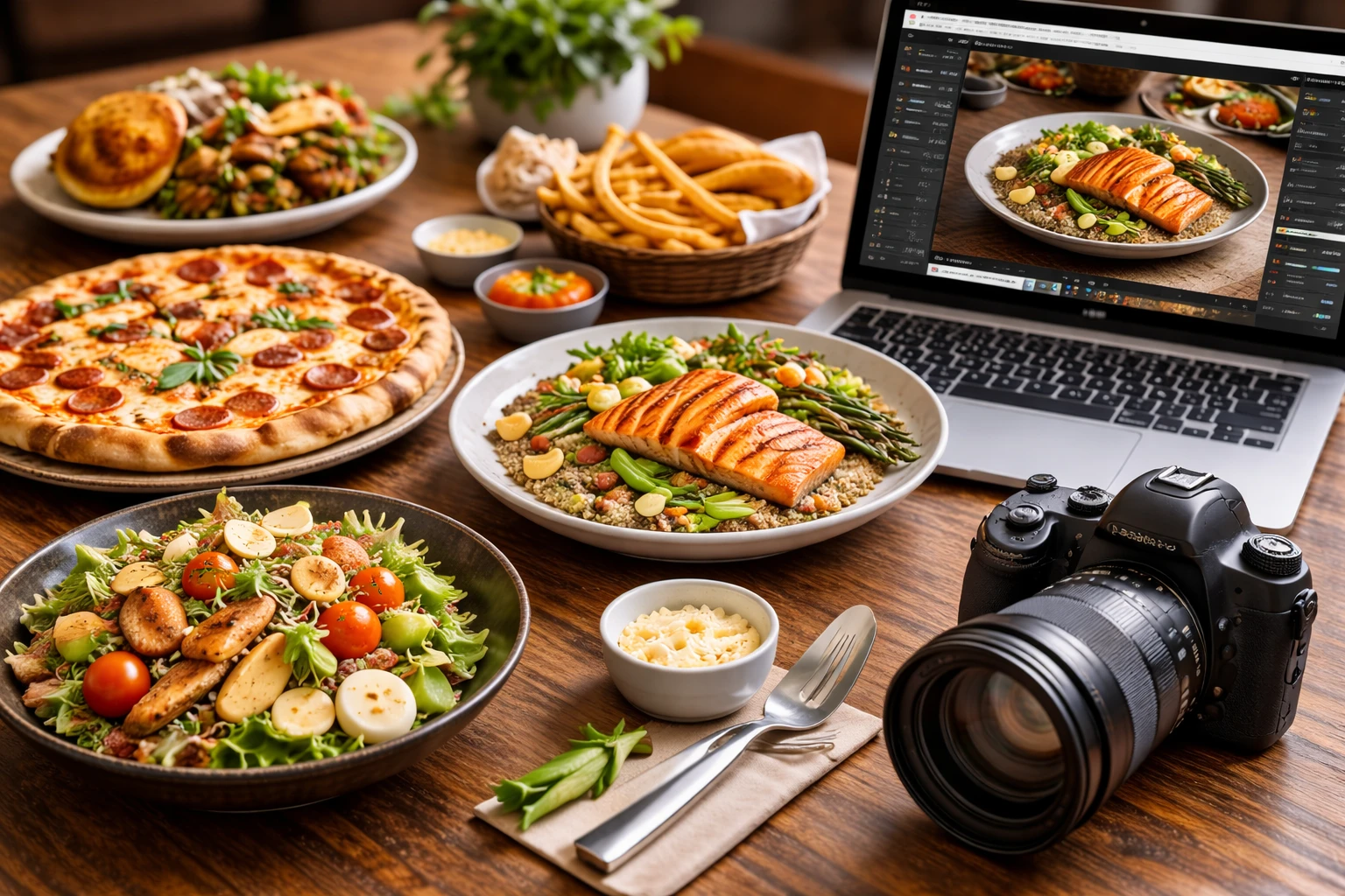
Image Compression Without Losing Food Photography Quality
Image compression reduces your photo file sizes so pages load faster without making your dishes look pixelated or washed out (your food photography stays gorgeous, promise).
In general, WebP format is a web development standard that cuts image file sizes by about 30% compared to JPEG. Your mobile site loads faster, and your restaurant photos still look sharp with this approach.
Along with that, lazy loading can delay off-screen images until people scroll down to them. This speeds up the initial page load significantly.
Pro Tip: Compress your hero images and menu photos to under 200KB each using free tools like TinyPNG or Squoosh. You can just upload your restaurant images, download the compressed versions, and replace them on your site.
Testing Your Mobile Page Speed (Free Tools You Can Use)
Every restaurant site we’ve tested in Queensland shows that images are usually the main problem when it comes to page speed.
Fortunately, Google PageSpeed Insights shows you which images, scripts, or code chunks are slowing your site down. It’s free and works well with specific recommendations. You can also use GTmetrix, which provides detailed reports with concrete fixes for improving load times on mobile devices.
Before going live, check your site on actual phones using different networks. Even better if you test on 4G, 5G, and Wi-Fi to see how various screen sizes and device types handle your page. Because what loads fine on your laptop might be painfully slow for mobile users on a cellular connection.
Make Your Restaurant Mobile-Friendly Today
Mobile-first design isn’t optional anymore if you want people to find you. Most customers now search for restaurants on their phones, and Google ranks mobile-friendly sites higher. So focus on thumb-friendly layouts, fast page speeds, and local SEO to capture hungry mobile searchers before they pick your competitor.
If you need help building a mobile-first design for your restaurant website that converts visitors into diners, Spoon Fed Atlanta specialises in food business websites. We’ve worked with Brisbane cafés, Queensland catering companies, and restaurants across three Australian states.
Check out our portfolio and see how we help restaurant businesses grow online and reach more customers through mobile.