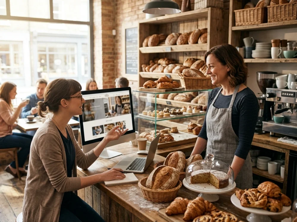
If you’ve ever wondered why some bakery websites feel warm and inviting, branding is the answer.
Food branding is all about what a customer sees, reads, and feels when they discover your bakery online. Colour palette, photography, and typography work together to build trust and start with an order.
That’s exactly what we’ll explore in this guide. At Spoon Fed Atlanta, we’ve built websites for food businesses across Australia, and we know what separates a website that converts from one that loses visitors in seconds.
We’ll cover user experience design, food photography, and the marketing decisions that give a bakery site that welcoming feel. By the end, you’ll have a clear picture of what to fix, what to add, and where to start.
Does Your Bakery Website Make People Hungry to Visit?
Your bakery website makes people hungry to visit when it leads with bold food imagery, warm colours, and an easy path to your menu. For local businesses, that first digital impression carries the most weight.
These five design basics separate a site visitors stay on from one they leave within seconds:
- Warm Colour Palette: Soft creams, warm browns, and dusty pinks signal comfort the moment visitors land on your page. Choose colours that reflect your bakery’s personality. This way, users will feel at home as they scroll.
- Readable Font Pairing: A handwritten header paired with a clean body font gives your business personality without making users work to read your menu. For headings, a designer who understands food branding will often reach for serif fonts.
- Clear Navigation Flow: Two clicks is all visitors should need to reach your menu, location, or contact page. Poor layout sends users away because they struggle to find key information quickly and lose patience.
- Above-the-Fold Appeal: Your homepage image is the first thing visitors see, so it needs to tell them what your bakery offers. Businesses often see more enquiries when they place their main product image above the fold.
- Mobile-Friendly Layout: According to Google’s research on local search behaviour, 57% of searches happen on a mobile device. A site that breaks on smaller screens loses customers in advance.
Honestly, a blurry logo or a broken menu sends customers straight to a competitor. So address those issues early to avoid a Google review (yes, people do judge a book by its cover).
Get these five right, and your website will feel as welcoming as walking through your front door on a Saturday morning.
What Does Good Bakery UX Design Look Like?
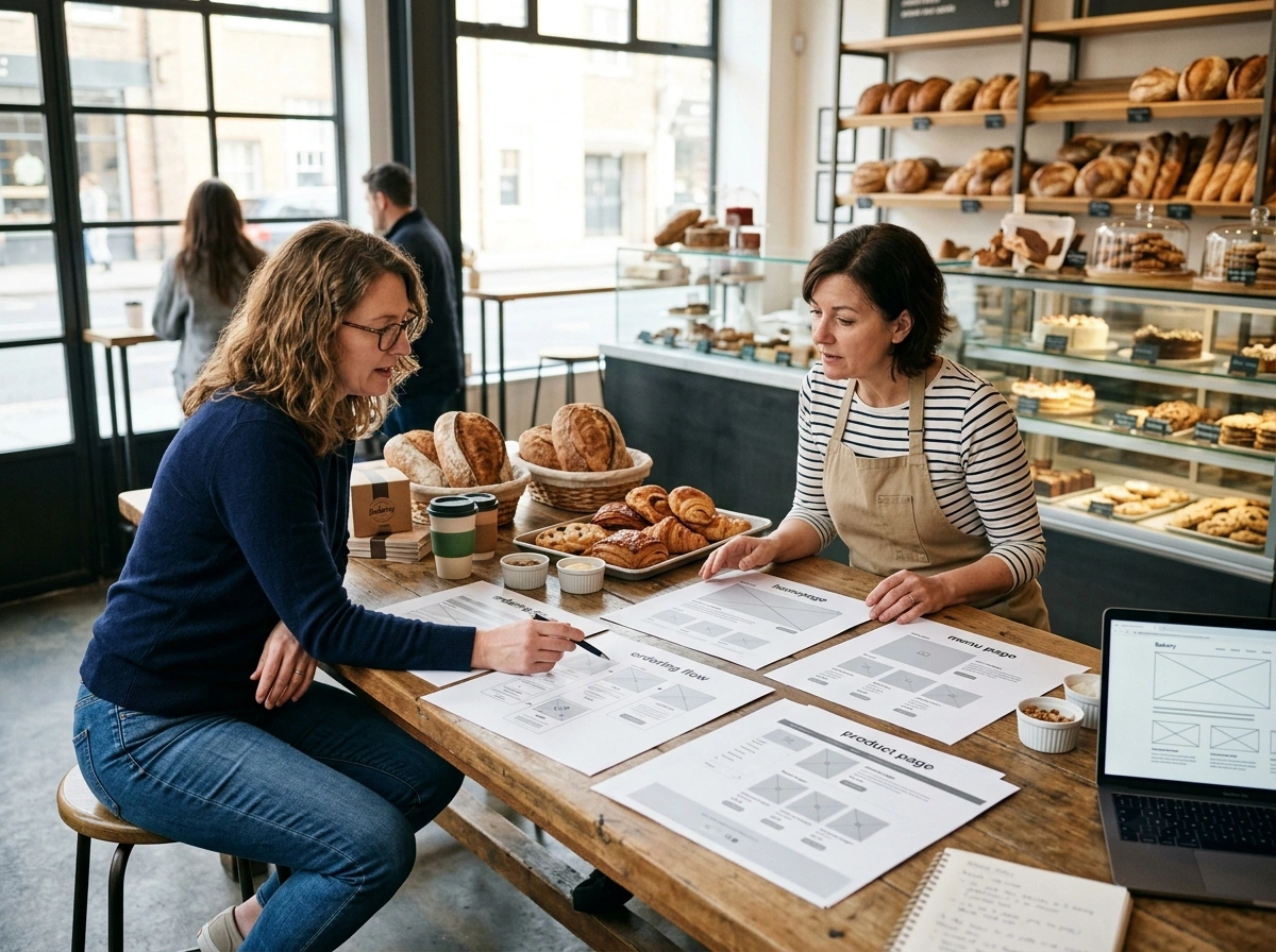
Good UX design means visitors can quickly find information like product details, delivery options, contact information, and clear calls to action. On the other hand, poor UX design can make you lose orders.
When your site performs well across every device and browser, customers stay longer and spend more per visit.
Two areas UX designers focus on most when building food business websites:
1. Interaction Design That Feels Natural to Click Through
Interaction design is the difference between a site that feels considered and one that feels abandoned.
For example, if a button hesitates or a menu misbehaves, visitors will lose confidence. That’s why your website’s every touchpoint, from the navigation bar to the order form, needs to perform smoothly.
In particular, small details like hover effects signal to users that your site delivers on usability. A client of ours dropped online orders simply because their Android users couldn’t load the menu page.
2. UX Designers’ Trick: Keep the Path to Purchase Short
UX designers usually suggest three steps or fewer from your homepage to a completed order. The concept is to remove every barrier between the visitor and the sale. After all, every extra step gives a customer another reason to close the tab and look elsewhere.
That’s why a prominent “Order Now” button placed above the fold removes uncertainty about what to do next. Clearly labelled checkout flows consistently achieve better results than multi-page processes. A shorter path converts more orders without extra marketing spend.
Can Your Food Photography Do the Selling for You?
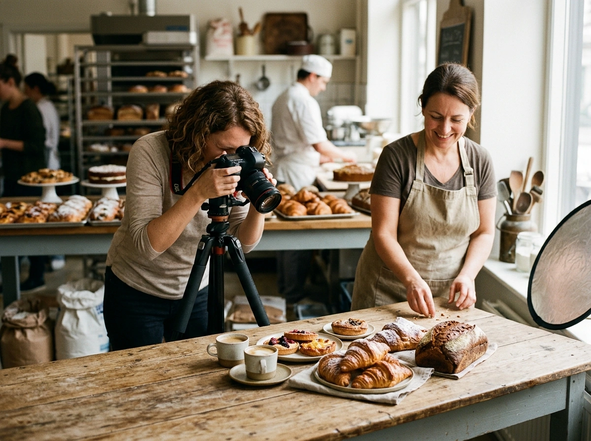
Yes, natural food photography sells your baked goods before a customer reads a single word on your page. A well-shot image builds an emotional connection with your brand. Potential customers decide within seconds.
A few photography principles worth applying for your next product shoot:
- Close-Up Clarity Matters: Because visitors scan, sharp and well-lit close-ups highlight texture, freshness, and detail, giving them a reason to stay and explore further.
- Blur Breaks Trust: A blurry image instantly feels unprofessional, and it signals poor quality, which can make visitors question your product and leave your site.
- Natural Light Advantage: For food brands, natural light and an uncluttered background let the product showcase itself through visual storytelling. It’s one of the most cost-effective branding tools available to a food business.
Even with no experience, simple adjustments in lighting and framing can improve how your baked goods appear online.
How Does Food Branding Determine the Way Customers Feel?
Consistent food branding gives your bakery a brand identity that customers can connect with instantly. Each colour, font, and image sends a signal about your values, your quality, and what people can expect. When those signals are off, even great baked goods can struggle to draw the right attention.
These four branding elements influence how customers view your bakery when they decide to order:
Branding Element |
What It Communicates |
Example |
|
Colour Scheme |
Warmth, freshness, or indulgence |
Cream and terracotta |
|
Logo Style |
Handcrafted vs. modern feel |
Script font vs. sans-serif |
|
Tone of Voice |
Friendly, artisan, or premium |
“Baked with love daily” |
|
Imagery Style |
Rustic, clean, or playful |
Flat-lay vs. lifestyle shots |
Every company in the food space is creating a story through these choices. A designer who builds brand identity approaches it the same way a baker approaches a recipe. Every ingredient has a role, and one missing element can make the whole concept feel incomplete.
The best café and bakery brands we’ve worked with in Queensland all share one thing: their packaging design, website photography, and typography tell the same story.
That kind of consistency builds recognition. Customers start to remember your brand by sight, and that familiarity drives repeat visits. It also sets your business up for future growth in a crowded local food market.
What Marketing Strategy Fits a Small Bakery Website?
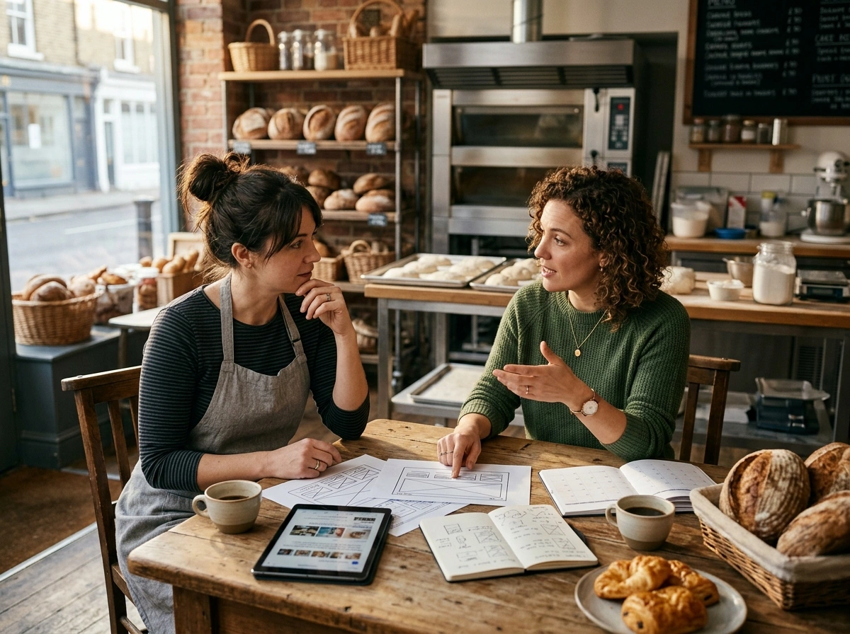
A local-first marketing strategy built around search visibility, strong branding, and easy ordering fits a small bakery website best. Most owners skip these steps and jump straight to paid advertising. That choice costs more money upfront and delivers fewer long-term results.
A few moves worth prioritising ahead of any spend on advertising:
- Google Business Profile: Ten minutes of setup puts your bakery in front of local users the moment they look for food nearby. This free listing covers Google Maps and the local pack, two of the highest-intent places your business can appear.
- Local SEO Basics: For bakeries in competitive suburbs, keywords like “sourdough bakery Paddington” help your pages rank ahead of other local businesses.
- Social Proof Section: Nothing convinces a hesitant visitor quite like reading what real users think of your baked goods. Collect user feedback regularly and display it on your homepage.
- Online Order Button: The “Order Now” button positioned above the fold serves as a powerful tool to enhance your conversion rate.
On top of that, a bakery website built with these basics and a mobile-friendly design will outperform a flashier site that ignores them. After all, websites require consistency, and that consistency leads to steady, reliable traffic over time (free tools, real results).
Your Bakery Deserves a Website That Works as Hard as You Do
A bakery website that feels inviting rarely happens by accident. Every design choice is important because branding and user experience together affect how customers experience your business online.
And honestly, when those elements work together, your website does look good. It builds credibility, draws in new customers, and gives people a reason to return and order again.
If you’re ready to give your bakery the online presence it deserves, Spoon Fed Atlanta can help. Our company works with food businesses across Australia to build sites that help visitors and loyal customers.
Reach out today and let us build something worth visiting.