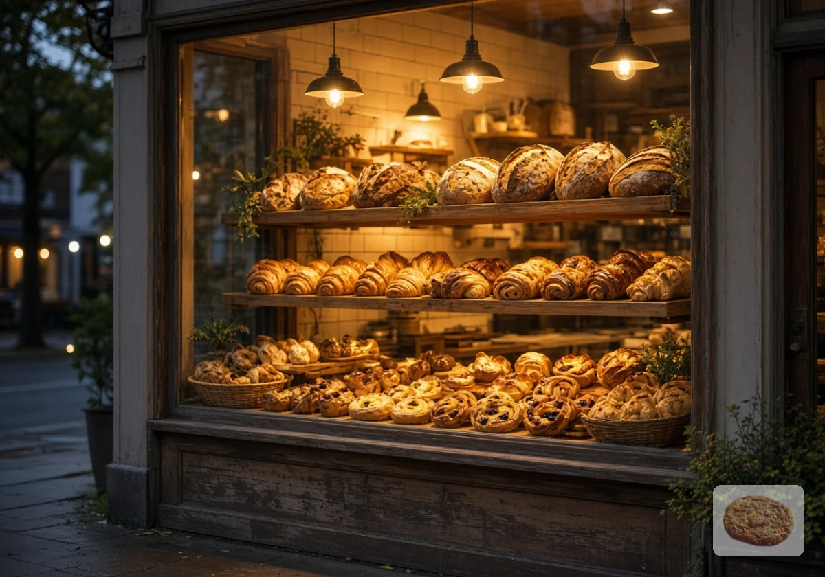
Good bakery website menu design splits daily products and custom orders into separate menus because customers buy them differently. Someone grabbing sourdough for the night wants to just tap, pay, and leave. Meanwhile, a couple planning a wedding cake wants to share an idea and get a quote.
Yet plenty of bakery sites squeeze both onto one shop page. At Spoon Fed Atlanta, we spend a lot of time on food business websites, and this mixed layout keeps showing up.
This guide covers why a combined menu slows online bakery ordering UX, what a fast daily menu needs, and how a custom cake form should work. Let’s start with the problem.
Why Does One Combined Menu Hurt Online Bakery Websites?
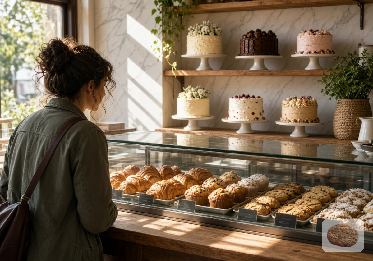
A combined menu makes online bakery ordering UX frustrating because customers buying everyday items and ordering custom cakes need different checkout processes. For instance, a croissant has a fixed price and a ready time. But a three-tier cake needs a size, a date, a flavour, and often a conversation before anyone can price it.
When everything shares one product grid, the checkout either overwhelms simple buyers or leaves custom cake customers without the details they need. Many web design templates handle this by giving the cake a fake fixed price or by adding cake fields to every order. However, those extra fields make an already lengthy checkout even harder to complete.
In fact, the Baymard Institute checkout usability benchmark found that the average US checkout flow already shows 23.48 form elements by default. Adding inscription text and photo uploads to a simple bread order pushes that load even higher.
Custom cake customers face a different problem. You’ve probably seen a cake listed with one fixed price and a tiny note saying “price varies.” That note sends people to your inbox with questions the page should’ve answered (and plenty of them never get around to hitting send). It’s a lost booking your business never even hears about.
The fix for both problems starts with structure rather than brand colours or fonts. Good website design for bakeries separates the two paths in the top navigation, and gives each its own layout, content, and checkout logic.
Daily Product Menus That Support Your Business
Once you decide to split the paths, the daily side has one job: get a regular from browsing to paid before their coffee goes cold. Five elements make the daily product menu easier to use:
- Fixed Prices: Nobody wants to open three product pages just to compare the cost of a croissant, a muffin, and a loaf. Display prices directly on each item card, alongside the product name and photo. Don’t forget to include any extra charges before checkout so the total doesn’t catch customers off guard.
- Live Sold-Out Badge: The last sourdough sells at the counter while someone else adds it to their online cart. Your stock system needs to account for both sales channels and update availability as orders come through. Once an item sells out, mark it clearly. Anyone who has run online ordering for a bakery knows how quickly a missed stock update leads to refund emails and annoyed regulars.
- Bake-Timed Pickup Slots: Fresh bread won’t be ready at 7 am if the first batch finishes at 8. Unsurprisingly, the 2026 Australia Post eCommerce Report found that 32% of shoppers would switch retailers for out-of-home collection options. That’s why you should set collection windows around your actual baking schedule and allow enough time for packing online orders. Customers should only see slots when their selected products will be ready.
- One-Tap Reorder: For regulars who buy the same loaf every Friday, repeating an order shouldn’t mean browsing the entire menu again. A reorder option on the home page or account screen saves those extra steps. Check stock and pickup availability before adding previous items to the cart.
- Category Tabs: Keep the categories visible on mobile and use familiar names so customers find their products quickly. Bread, pastries, and sweets each deserve their own clearly labelled section. Someone looking for a birthday treat shouldn’t have to scroll past every sandwich and sourdough loaf.
Check all five on your own phone during a busy morning, and fix anything that makes you scroll twice. Among the features, the sold-out badge deserves the most testing. After all, it’s the one element that costs you refunds when it fails.
Custom Cake Order Features Work Like a Booking Form
A custom cake order website collects a brief, prices it within a range, and books a production slot, which is how a booking form works. The customer is requesting a cake rather than buying one, so the page should ask questions in the order your kitchen needs answers.
We’ve broken that form into the five steps your customers move through below.
1. Size, Servings, and a Starting Price Instead of a Fixed One
Start with servings, because customers usually know their guest count before they know which cake size to choose. A “20 to 25 guests” option then maps to a set size on your kitchen sheet. Next, show a “from” price beside each size. That way, customers get a realistic starting figure, while you leave room to price the decoration and other custom requests.
Pro Tip: Include a simple serving guide with slice sizes, especially for wedding cakes. A cake serving 30 small wedding portions won’t necessarily provide 30 generous party slices.
2. Flavours, Fillings and Dietary Options the Kitchen Can Really Deliver
Only list the flavours, fillings and dietary options your kitchen can make every week. If gluten-free needs a separate bench you don’t have, leave it off.
Then pair each choice with clear allergen information, including ingredients such as nuts, milk, and eggs. Anyone with food allergies needs accurate details before choosing a flavour (usually well before their eyes ever reach the price). Be clear about possible cross-contact in your kitchen too.
Don’t forget to review the list each season. Remove anything you’ve stopped offering, so the form never promises a filling you can’t source.
3. The Design Brief: Colours, Theme and Reference Photo Uploads
The design brief is where customers explain what they’re picturing. You can give them a colour field, a theme field, and an upload button for reference photos.
A clear photo often tells your decorator more about the preferred piping, finish, or overall style than a long written description. Still, customers should explain which parts of the reference they want you to follow.
To keep things manageable, cap uploads at three and ask which detail they love most. Their answer tells you what to keep when a design needs simplifying.
4. A Date Picker With Your Lead Time Already Built In
Your date picker should automatically block dates that fall inside the kitchen’s minimum lead time. If tiered cakes need seven days of preparation, customers shouldn’t see earlier collection dates as available.
You’ve probably had someone request a wedding cake for this Saturday when your kitchen is already booked. A calendar that reflects your actual schedule prevents that request from reaching the quote stage.
We recommend setting different lead times for simple and complex cakes, and blocking dates when production reaches capacity. This way, customers can choose dates your team has a realistic chance of fulfilling.
5. Deposit, Approval and What the Customer Sees Next
After submitting the form, customers need confirmation that their request reached you. Tell them when to expect a quote, what deposit secures the booking, and when the remaining balance is due. Use the same information in your automatic confirmation email.
Once you’ve reviewed the design and confirmed availability, send a quote with a clear approval step and deposit payment link. Customers then have the price, payment details, and booking terms in one place.
Quick Tip: Keep the date provisional until they approve the quote and pay the required deposit. This prevents customers from assuming their cake is booked simply because they submitted the form.
Comparing the Two Templates Before You Build Either One
The daily menu and custom cake page now have separate ordering steps, but your website still needs to handle both. Pricing, availability, and payment work differently for each.
Use this side-by-side comparison to show your designer or website builder what each layout needs:
| Feature | Daily Product Menu | Custom Cake Order Page | What to Do |
|---|---|---|---|
| Pricing | Fixed per item | “From” price by size | Never show a fixed cake price |
| Main action | Add to cart | Submit a request | Use different button wording |
| Limits | Stock count | Kitchen capacity and lead time | Connect each to a live setting |
| Payment | Full payment at checkout | Deposit after quote | Pick a platform that handles both |
The payment row deserves a closer look when choosing your platform. Some basic shop tools handle full payments but don’t support deposits after quote approval. Check that your system supports both processes, so you don’t have to manage custom cake payments separately.

Build the Two Menus Your Customers Are Already Looking For
The summary is: daily buyers and custom cake customers want different things from your site. And two separate menus let each group finish their order without wading through the other’s options.
So start by auditing your current menu for fake cake prices and extra checkout fields. Then sketch both paths on paper before you touch any templates.
Ready to split your menu the right way? Get in touch with Spoon Fed Atlanta for bakery website menu design that suits both daily regulars and custom cake customers.